How to Prevent Sublimation Color Differences in Custom Jerseys
Color differences in custom sublimated jerseys usually do not come from one isolated mistake. They appear when a color moves through several different systems: a buyer’s screen, an artwork file, color-management software, sublimation ink, transfer paper, heat-press settings, polyester fabric, sewing, lighting, and finally the human eye. A mockup can look correct while the printed swatch looks darker. An approved swatch can appear different when the same color covers an entire jersey. A repeat order can drift if the fabric lot or production parameters change.
For teams, distributors, uniform dealers, and private-label brands, the practical objective is not to promise an impossible “zero difference.” It is to define the color target, approve a physical reference, control the variables that affect reproduction, and agree in writing how acceptable variation will be judged. This guide explains how to build that system before bulk production.
Quick Answer: How Do You Prevent Sublimation Color Differences?
Prevent sublimation color differences by using one controlled approval chain: provide the original artwork and a physical color target; confirm the exact polyester fabric; print swatches with the intended printer, ink, paper, profile, temperature, time, and pressure; review them under agreed lighting; approve a complete sample when color placement is critical; compare the first bulk-production piece with the approved reference; and retain the fabric, production settings, and Golden Sample for reorders.
A screen mockup is useful for approving layout, but it is not a final color standard. Pantone describes its systems as tools for communicating color, while Adobe explains that devices and software may use different color spaces. Sublimation equipment manufacturers also emphasize that time, temperature, pressure, profiles, and media settings affect output. The safest purchase decision is therefore based on a physical printed reference produced on the intended material.
Why Do Colors Differ from Digital Mockups?
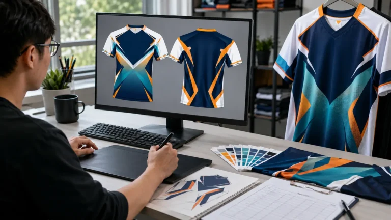
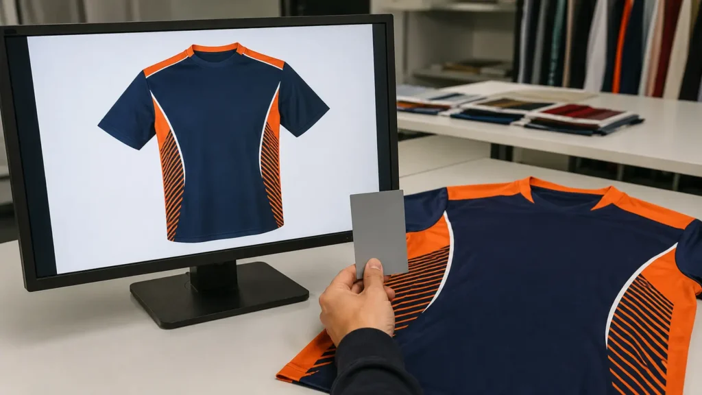
A digital mockup and a sublimated jersey are different objects created by different technologies. A monitor produces color with emitted light. A jersey reflects ambient light from dyed polyester fibers. Bright blues, oranges, greens, and fluorescent-looking effects can appear especially vivid on a backlit display but fall outside what a particular printer, ink, profile, and fabric combination can reproduce.
The mockup may also be viewed on several uncalibrated devices. A buyer may approve it on a bright office monitor, forward a screenshot through a messaging app, and then review it again on a phone with automatic brightness or a warm-night display enabled. Each step can change the appearance without changing the underlying design values.
Adobe’s color-management guidance explains that a color-management system translates color between the space in which it was created and the space in which it will be output. Epson similarly recommends using an ICC output profile that matches the printer and loaded media, noting that a custom profile may be needed for the best result. These tools improve control, but they do not turn a screen into a physical fabric standard.
Use the mockup to approve:
- artwork placement and scale;
- names, numbers, sponsor marks, and spelling;
- panel boundaries and seam alignment;
- the intended relationship among colors;
- the overall visual direction.
Use a physical printed swatch or sample to approve:
- the actual appearance of critical brand colors;
- lightness, darkness, hue, and saturation on the selected fabric;
- the effect of the fabric’s white point and texture;
- the interaction of adjacent colors;
- the production reference for bulk inspection.
RGB, CMYK, Pantone, and Physical Color Are Not Interchangeable
Buyers often send RGB, CMYK, HEX, and Pantone references together as if they were four equivalent descriptions. They are related, but they serve different functions.
| Reference | What it represents | Useful for | Main limitation in sublimation |
|---|---|---|---|
| RGB | Additive light values used by screens and many digital workflows | Artwork creation, digital mockups, online review | Appearance depends on display, calibration, brightness, and software |
| CMYK | Process-print ink values | Some print artwork and conversion workflows | One CMYK recipe does not guarantee the same result across devices and substrates |
| Pantone | A standardized color communication target within a specified Pantone system | Communicating a brand target and comparing physical references | A target color may not be exactly reproducible by the available sublimation gamut |
| Physical printed swatch | Actual ink, process, and fabric result | Final visual approval and bulk comparison | Valid only for the documented material and production conditions |
| Golden Sample | Approved finished product or controlled panel | Bulk inspection and repeat-order reference | Must be identified, protected, and periodically reviewed for aging or damage |
Pantone explains RGB as a color space based on the primary colors of light and distinguishes color systems designed for different materials and production uses. A Pantone number should therefore include the relevant system or physical reference where possible. A code copied from a web converter is not equivalent to viewing a current physical standard.
CMYK values also should not be treated as universal machine instructions. The same nominal values can reproduce differently when the printer, ink set, transfer paper, profile, rendering method, or fabric changes. In a managed sublimation workflow, the supplier may request RGB artwork and let the production profile convert the values for the specific output system. In another workflow, the supplier may specify a different file space. The buyer should follow the supplier’s documented artwork workflow rather than converting files repeatedly.
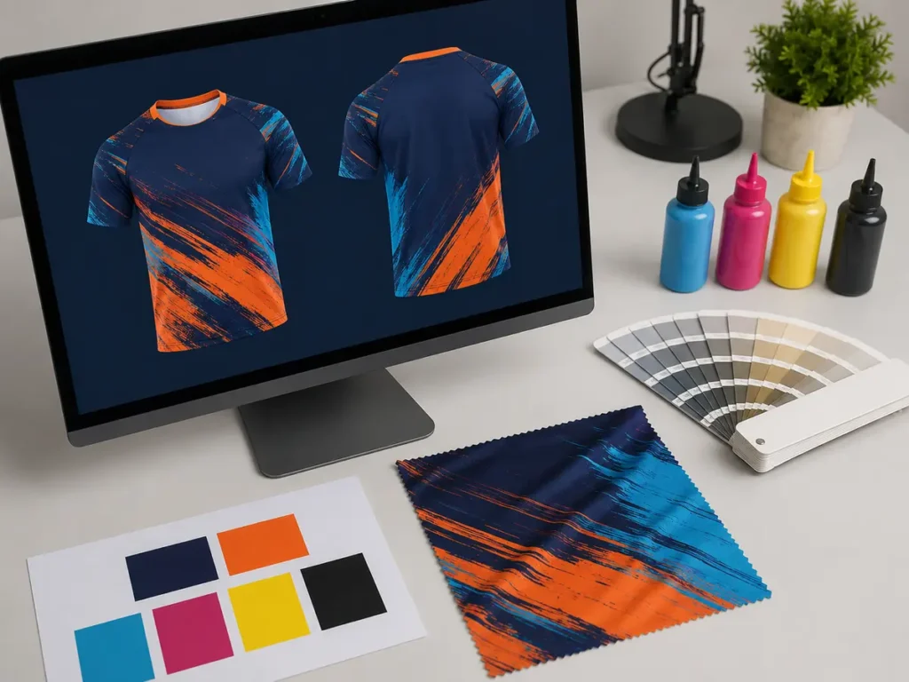
Can Sublimation Match Pantone Exactly?
Sublimation can often achieve a close visual match to many brand colors, but an exact match should not be promised before testing. The attainable result depends on the color’s position within the printer-and-material gamut, the ink set, the color profile, fabric, heat-transfer conditions, and viewing method. Very bright, highly saturated, metallic, fluorescent, or material-specific colors may not translate exactly to standard sublimation ink on polyester.
A practical supplier response is one of three outcomes:
- Target achievable within the agreed visual tolerance. The supplier prints and documents the approved recipe.
- Closest producible match. The supplier presents one or more physical alternatives and the buyer selects the acceptable option.
- Target requires redesign or another decoration method. The buyer adjusts the artwork, separates a critical logo application, or chooses a different process after testing.
The phrase “Pantone matched” should mean that a physical output was compared with an agreed Pantone reference under defined conditions—not merely that a Pantone code was typed into an artwork file.
How Fabric Changes Sublimation Color
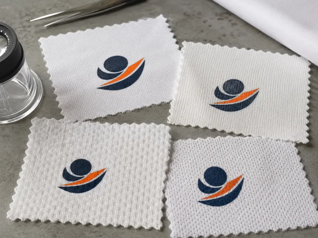
Dye sublimation bonds color with suitable synthetic fibers, most commonly polyester in teamwear. The fabric is not a neutral carrier. Its fiber composition, base whiteness, optical brighteners, knit construction, texture, finish, and weight all influence the final appearance.
Polyester Content and Dye Response
Changing the fiber blend can change saturation and wash performance. A high-polyester performance fabric may reproduce color differently from a blended fabric even when both are described as “white jersey fabric.” Buyers should approve the exact material code intended for production rather than a convenient substitute swatch.
White Point
One white fabric may look cool and blue; another may look warmer or creamier. Because sublimation ink is generally translucent, that base contributes to the perceived result. Pale grays, skin tones, light blues, and neutral brand colors may reveal this difference more readily than dark saturated areas.
Surface Texture and Light Reflection
Smooth interlock, birdseye mesh, pin-dot mesh, and other performance knits scatter light differently. A glossy or smooth surface can appear more saturated in one viewing direction, while an open or textured knit can break up fine details and visually lighten a solid area. The same printed data can therefore produce two acceptable but visibly different results on two fabrics.
Fabric Lot and Finish
Even when the material specification remains unchanged, separate production lots can show small differences in white point, surface finish, or heat behavior. The supplier should identify the fabric lot used for the approved sample and check replacement lots when the color is critical. For long programs, reserve material where commercially practical or require a fresh swatch approval if the original lot is no longer available.
Time, Temperature, Pressure, and Production Parameters
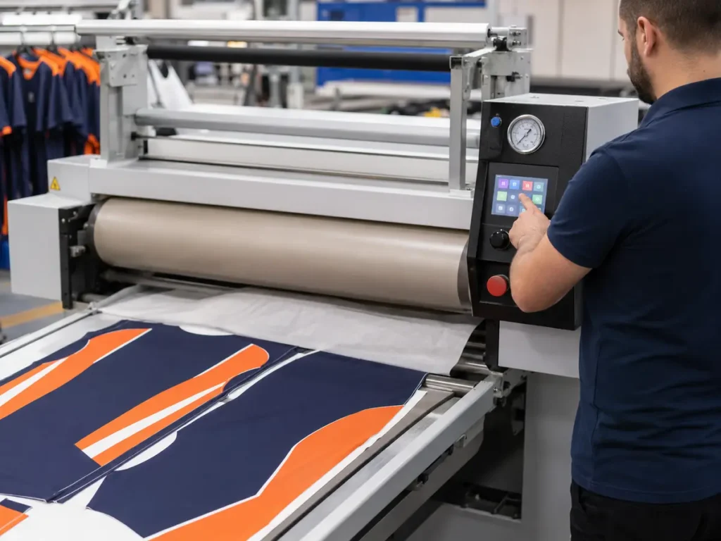
Sublimation is a controlled transfer process. Sawgrass states that time, temperature, and pressure settings affect color and should be selected for the specific blank or material. Slight changes can alter saturation, sharpness, or hue. In industrial apparel production, control also extends to printer condition, ink, transfer paper, environment, press uniformity, and operator procedures.
| Variable | Possible visual effect when uncontrolled | Control action |
|---|---|---|
| Temperature | Underdevelopment, excessive darkening, hue shift, scorching, or uneven areas | Verify actual platen or roller temperature and use the approved setting window |
| Dwell time | Too little transfer or excessive dye migration and darkening | Record approved line speed or press time and monitor production |
| Pressure | Incomplete transfer, uneven density, texture changes, or press marks | Use a repeatable pressure setting appropriate to the fabric and equipment |
| Ink and printer condition | Density or channel imbalance, banding, inconsistent color | Maintain equipment, run checks, and record ink and printer information |
| Transfer paper | Changed release behavior, density, or sharpness | Keep the approved paper specification and qualify substitutions |
| ICC/output profile | Incorrect conversion for the printer-media combination | Use the approved profile and prevent duplicate color management |
| Fabric moisture and environment | Uneven transfer, color instability, or handling problems | Condition and store material appropriately; document unusual conditions |
| Fabric lot | White-point, finish, or heat-response variation | Identify the lot and revalidate critical colors when it changes |
An ICC profile describes how a device-and-media combination reproduces color. Epson’s official guidance recommends choosing the output profile that matches the loaded media and notes that a custom profile may be necessary. The profile should therefore be treated as part of the production recipe. “Use ICC” is not enough; the record should identify which profile and workflow were approved.
Factories should also avoid uncontrolled double color management, where both the design application and printer software independently transform the same data. The exact configuration depends on the equipment and software, but the approved workflow should be repeatable and restricted from casual changes during a program.
Why a Small Swatch Can Look Different from a Full Jersey
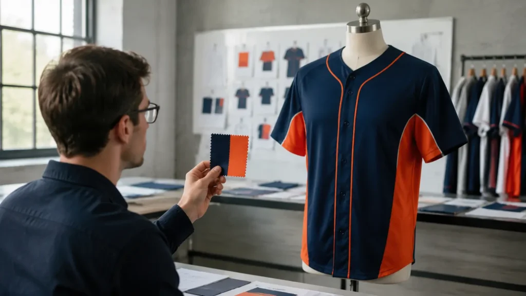
A swatch is necessary, but it does not answer every visual question. A two-inch blue square and a jersey covered by the same blue can feel different because the human eye judges color in context.
Several factors change the perception:
- Area effect: a color covering a large panel can appear more dominant or intense than the same color in a small chip.
- Simultaneous contrast: adjacent orange, white, black, or gray can make a blue appear lighter, darker, warmer, or cooler.
- Curvature and drape: a jersey wraps around the body, creating highlight and shadow.
- Mesh and ventilation zones: multiple fabric structures can occur in one garment.
- Seams and panel alignment: a color crossing panels may look interrupted or slightly different as the fabric direction changes.
- Names and numbers: large white or contrasting graphics change the overall balance.
- Viewing distance: a small swatch is inspected closely; a uniform is normally seen from several feet away.
For a simple design with one approved fabric and established production settings, a swatch may be sufficient. For a new brand color, large solid field, gradient, dark-to-light transition, multiple fabrics, or color-critical sponsorship logo, approve a complete physical sample before bulk production.
The Four-Level Color Approval Workflow
A strong approval system moves from the least expensive test to the most representative production reference.
Level 1: Digital Artwork and Color Target
The buyer supplies editable vector artwork where practical, embedded color profiles, named spot or brand-color references, and a current physical reference for critical colors. The supplier confirms the working file format, color workflow, fabric code, and any known gamut limitation.
Digital approval locks the design version and placement. It does not lock the final physical color.
Level 2: Printed Swatch
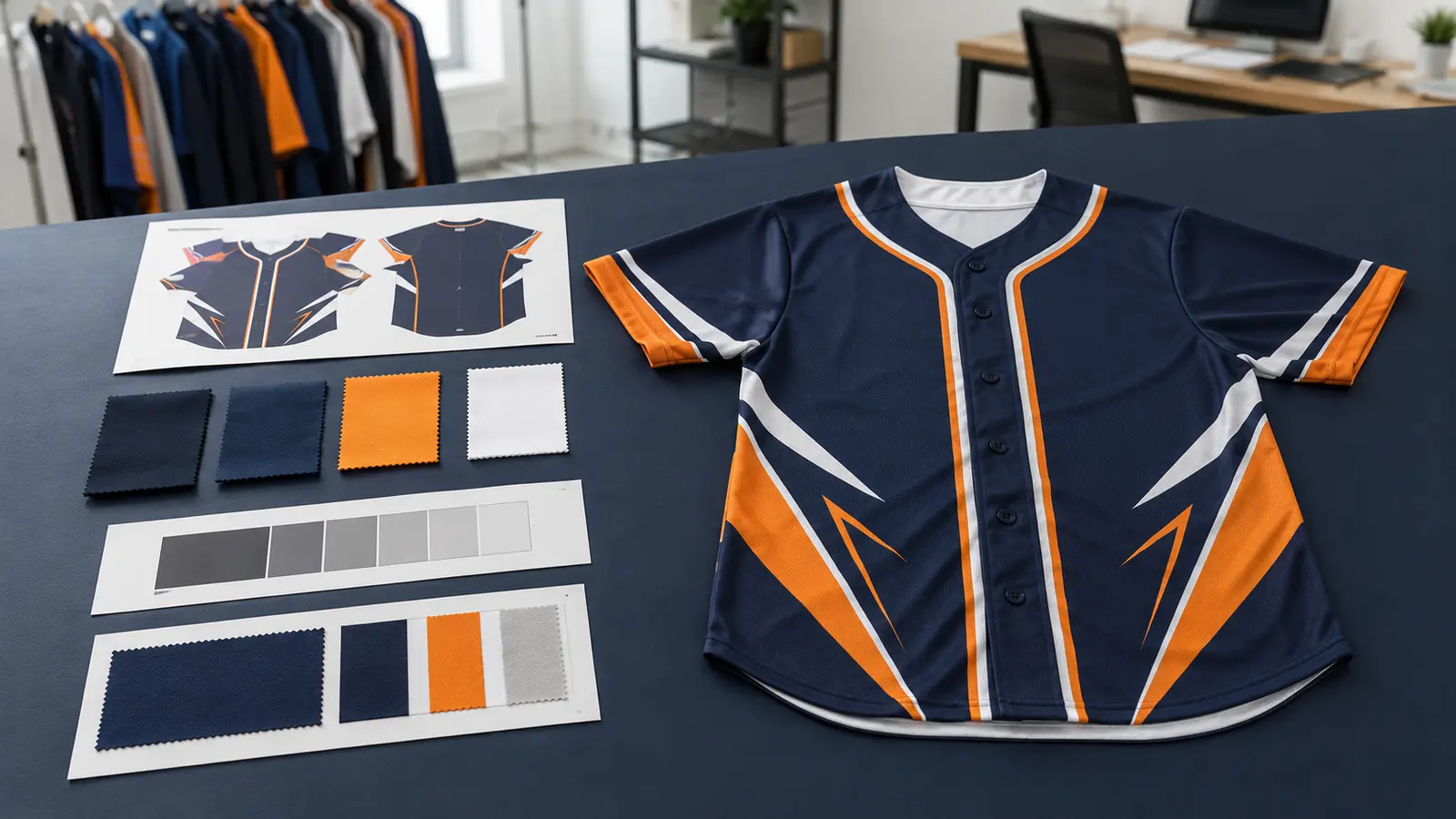
The supplier prints a test on the actual intended fabric using the planned output workflow. A useful color strip may include the requested target plus controlled lighter, darker, warmer, or cooler alternatives. Every option should have an internal code so the selection cannot be confused later.
Review the finished fabric, not the transfer paper. Sublimation colors often look different before transfer. Examine the swatch under the agreed light source and, when relevant, the buyer’s retail, stadium, school, or office environment.
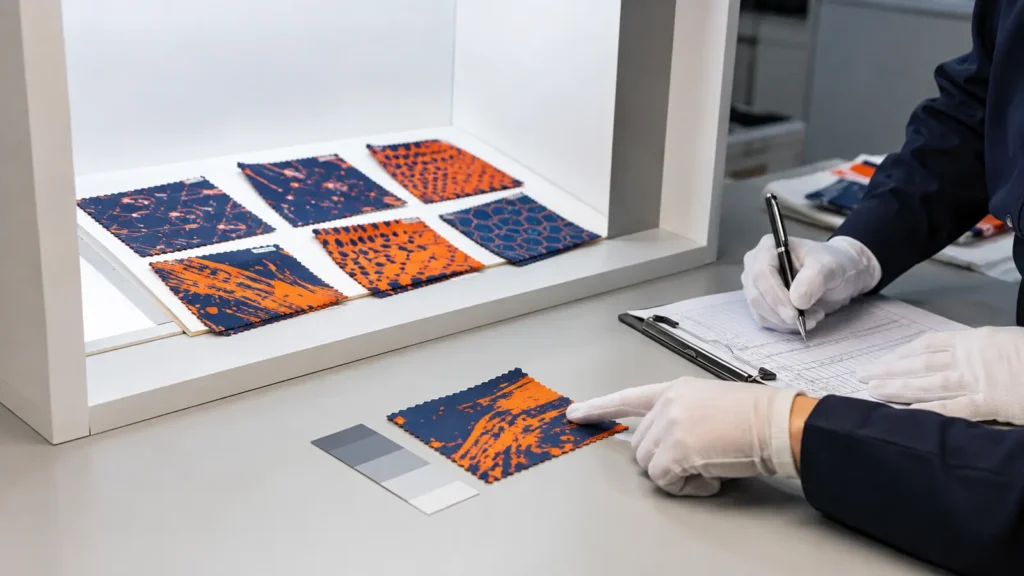
Level 3: Complete Physical Sample
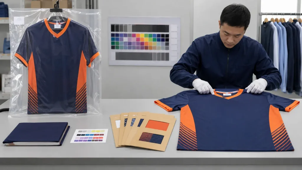
The sample confirms how color works across the entire product. Inspect both visual color and construction: different panels, mesh areas, rib, cuffs, collar, seams, logo edges, names, numbers, and any separately applied decoration. Photograph the sample for communication, but retain the physical item as the controlling reference.
Approve, approve with listed revisions, or reject. Do not use ambiguous comments such as “make it brighter” without identifying which area, reference, and preferred correction.
Level 4: Bulk First Piece or Pre-Production Confirmation
Before the production lot proceeds at full scale, compare a first finished panel or first complete garment against the approved swatch or sample. Confirm that the fabric, profile, settings, and design version match the approved record. This step catches an incorrect file, fabric substitution, profile change, or equipment-setting error before it affects the whole order.
Bulk inspection should then verify consistency within and among cartons. It is not a substitute for buyer approval of the original color target.
Sublimation Color Approval Form
Use a written record rather than an approval scattered across email, messaging apps, and screenshots.
| Field | Required information |
|---|---|
| Project and purchase order | Project name, PO number, buyer, supplier |
| Artwork version | Filename, revision number, approval date |
| Critical colors | Color name, target system/code, physical reference supplied |
| Fabric | Supplier material code, composition, weight, construction, color, lot if known |
| Output workflow | Printer/line ID, ink system, transfer paper, profile or preset ID |
| Transfer settings | Approved time or speed, temperature, pressure setting |
| Swatch options | Internal option codes and selected option |
| Viewing condition | Agreed light source/environment and observation method |
| Approval object | Swatch, full sample, or Golden Sample identification |
| Decision | Approved / approved with revisions / rejected |
| Tolerance method | Visual master, instrumental target if agreed, and escalation rule |
| Sign-off | Buyer name, supplier name, date, and comments |
How Should “Allowed Color Difference” Be Defined?
Do not insert a universal numerical tolerance without validating the product, color, instrument, standard, and business requirement. A numerical ΔE result can help quantify difference, but the formula, measurement geometry, aperture, backing, fabric texture, conditioning, and light source affect interpretation. A visually acceptable tolerance for a textured jersey may be different from one for a smooth printed card.
For many custom teamwear orders, the most practical contract is:
- the approved physical swatch or Golden Sample is the primary visual master;
- evaluation occurs under an agreed neutral light and at an agreed viewing distance;
- obvious panel-to-panel or garment-to-garment variation is not acceptable;
- if the supplier and buyer disagree, they follow the predefined recheck and escalation process;
- any instrumental tolerance is product-specific and written into the specification before production.
This approach is more defensible than stating “100% Pantone match” or using an unexplained ΔE number copied from another product category.
Bulk First-Piece and Production QC Checklist
Before releasing full production, confirm:
- correct purchase order and artwork version;
- correct player names, numbers, sizes, and roster data;
- approved fabric code and current fabric lot;
- approved printer or production line;
- approved ink, paper, and profile/preset;
- documented time, temperature, pressure, or line speed;
- critical colors compared with the approved physical reference;
- color consistency across different garment panels;
- gradients, shadows, and fine details reproduce cleanly;
- seams do not create unintended white gaps or abrupt color changes;
- separately produced trims and panels coordinate acceptably;
- first finished garment is identified and retained;
- inspection lighting and result are recorded;
- nonconforming pieces are isolated rather than mixed with approved production.
If the first piece does not match, stop and determine whether the cause is the file, color conversion, profile, printer condition, paper, heat-transfer settings, fabric, or viewing method. Reprinting without identifying the changed variable can create another uncontrolled result.
What to Preserve for Repeat Orders
Repeat-order consistency depends on preserving more than a color code. A buyer may reorder six months later and expect the new uniforms to match the original set. If the original fabric, ink batch, machine, or profile is unavailable, the Golden Sample becomes the key visual reference and a fresh swatch may be necessary.
Maintain a repeat-order color archive containing:
| Record group | Items to preserve |
|---|---|
| Commercial | Customer, project, PO, SKU, order date, destination |
| Artwork | Editable source, production PDF/TIFF as applicable, version, embedded profile |
| Color | Target codes, selected swatch code, photographs for reference only |
| Material | Fabric code, composition, weight, knit, white point reference, lot information |
| Printing | Printer/line, ink system, paper, RIP/software version, ICC profile or preset |
| Transfer | Temperature, time or speed, pressure, equipment ID, operator/shift record |
| Approval | Signed swatch form, approved sample ID, approval date and approver |
| Retained evidence | Fabric swatch, printed panel, Golden Sample, storage location |
| Reorder review | New fabric-lot comparison, profile changes, new test result, buyer reapproval if required |
Store the Golden Sample away from direct light, heat, moisture, contamination, and unnecessary handling. Attach a durable internal identification record without relying on a loose handwritten note. Both buyer and supplier may retain a sealed reference when color risk is commercially significant.
For a deeper look at controlling repeat production, see Repeat Order Consistency. Buyers can also review JIUMU’s Quality Control approach before approving a production plan.
What Should Buyers Send for a Reliable Quotation?
Color-control work affects sampling, production planning, and cost. Send the following with the quotation request:
- intended product and link to the relevant Custom Team Jerseys style;
- quantity by design, color, and size;
- editable logo and artwork files;
- names, numbers, and roster requirements;
- critical brand colors with the correct Pantone system or physical master;
- proposed fabric type, composition, weight, and performance needs;
- whether a printed swatch, complete sample, or both must be approved;
- acceptance method and any contractual tolerance;
- repeat-order expectations and expected program duration;
- target delivery date and destination;
- packaging, labeling, and shipment requirements.
If you are sourcing fully printed uniforms, review the available Sublimated Jerseys page and send JIUMU your artwork, quantities, color references, fabric preference, and deadline. JIUMU can confirm the appropriate mockup, swatch, sample, and bulk-production sequence for the specific project.
Common Mistakes That Create Color Disputes
Approving a Phone Screenshot
A screenshot discards or changes useful file information and is displayed differently by every device. Keep it for communication, not as the contractual color master.
Sending Only a Color Name
“Royal blue,” “navy,” and “bright red” describe families, not precise targets. Provide a defined system and a physical reference for important brand colors.
Approving a Swatch on a Different Fabric
A convenient smooth polyester swatch may not predict the same color on textured mesh. Test the intended fabric or explicitly accept the risk.
Changing Fabric After Sample Approval
A substitute may meet weight and composition requirements yet differ in white point, texture, or heat response. Reapprove critical colors after a material change.
Treating a Small Swatch as the Whole Design
Large color fields, gradients, multi-panel layouts, and contrasting graphics should be reviewed on a complete sample.
Using Vague Revision Language
“A little brighter” can mean lighter, more saturated, warmer, or simply more vivid on screen. Reference a coded sample option or specify the direction clearly.
Losing the Approved Sample
Without a controlled Golden Sample and production record, a repeat order becomes a new matching exercise. Assign version numbers and storage responsibility before shipment.
Questions to Ask a Sublimated Jersey Supplier
- Which artwork color space and file profile should we use?
- Will the swatch be printed on the exact bulk fabric?
- How do you identify printed swatch options and record approval?
- Which printer, ink, transfer paper, and output profile are planned?
- How are temperature, time, pressure, and line settings controlled?
- What happens if the fabric lot changes after sample approval?
- Can we approve a complete physical sample for large solid colors or gradients?
- Is a bulk first piece compared with the approved reference?
- How do you isolate and investigate out-of-tolerance pieces?
- What records and physical samples are retained for reorders?
- How long are Golden Samples retained, and under what conditions?
- Which changes require buyer reapproval?
Specific answers are more useful than a general claim that the factory can “match any color.”
How JIUMU Supports Color-Controlled Custom Teamwear
JIUMU supports OEM and ODM development for custom teamwear, including sublimation printing, fabric sourcing, color matching, digital mockups, physical samples, bulk production, quality control, private labeling, packaging customization, and export support. Typical MOQ is 50 pieces, subject to product structure and customization.
For a color-critical order, JIUMU can structure the project around the information supplied by the buyer: artwork version, physical target, selected fabric, printed swatch, complete sample where required, written approval, production reference, and repeat-order record. The achievable match and approval steps must be confirmed for the actual design, material, quantity, and schedule.
Send your editable artwork, critical color references, desired fabric, quantity by size, and target delivery date to request a project-specific color approval plan. If you already have a previous jersey or printed standard, state whether it can be shipped as the physical master.
Frequently Asked Questions
Final Recommendation
The best way to prevent sublimation color differences is to replace an informal “looks right on screen” approval with a documented physical color-control system. Define the target, test the actual fabric, approve a coded swatch, escalate to a complete sample when the garment context matters, compare the first bulk piece, and retain both the Golden Sample and the production recipe.
No responsible supplier can make every screen, Pantone reference, fabric lot, and production run look absolutely identical under every light. A responsible supplier can identify the controllable variables, show the buyer a representative physical result, record the decision, and repeat the approved process as closely as the materials and equipment allow.
Request a Sublimation Color Approval Pla
For a custom jersey quotation, send JIUMU your artwork, color references, quantity and size breakdown, selected or desired fabric, sample requirements, delivery date, and shipping destination. Contact the team through the Contact Us page, email zhengdong@jiumugear.com, or WhatsApp +86 18507502899.
Technical Sources
- Pantone: Understanding Different Color Spaces
- Pantone: Pantone Color Systems Explained
- Adobe: Understanding Color Management
- Epson: Colors Do Not Match the Computer Monitor
- Sawgrass: Troubleshooting Sublimation Color Issues
- Sawgrass: Print Shop and Sublimation Glossary
About JIUMU
JIUMU is a Guangdong-based B2B supplier of custom teamwear, logo apparel, hats, uniforms, bags, and branded merchandise. Established in 2010.