Why Does Small Text Look Bad in Hat Embroidery?
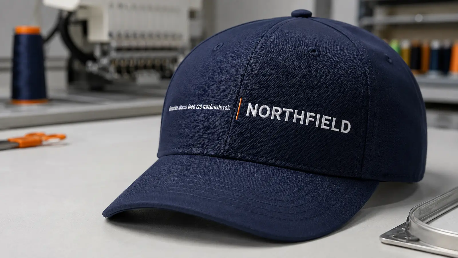
Small text can look precise on a monitor and become thick or crowded after it is embroidered on a cap. A cap is curved and layered, while embroidery uses physical thread, needle penetrations, underlay, compensation, and a defined sewing sequence. At small sizes, these elements compete for limited space.
The question is whether a sample remains readable at normal viewing distance—and repeatable in bulk.
Quick answer: Start by testing simple block lettering at roughly 5–6 mm (about 0.20–0.24 in) in capital height rather than treating any number as universal. Madeira reports block lettering around 6–7 mm with 40-weight thread and near 3 mm with 60-weight thread under suitable conditions. These are capability references, not buying guarantees. Cap structure, font, spacing, and placement may require larger letters. Approve an actual-size physical sample before bulk production.
Small-text embroidery decision table
| Artwork condition | Direct flat embroidery | 3D puff | Woven patch | Recommended first action |
|---|---|---|---|---|
| Bold uppercase text with open spacing | Usually the strongest direct-embroidery candidate | Possible only when strokes and gaps are wide enough for foam | Also possible | Test at actual size on the selected cap |
| Thin serif or condensed text | High risk as size decreases | Poor candidate | Often better | Remove serifs, widen letters, or test a woven patch |
| Handwritten or connected script | Connections and loops may close | Usually unsuitable for small text | Better for fine detail, within weaving limits | Create a simplified embroidery version |
| URL with punctuation and many characters | Readability risk rises quickly | Not recommended | Often better, but still test | Shorten the URL or move it to another medium |
| Small side or rear text | Possible with simplified artwork | Rarely appropriate | Possible if patch size suits the area | Confirm the exact placement and hoop limit |
| Bold initials or short monogram | Good candidate | Strong candidate if strokes are broad | Possible but less dimensional | Choose the desired texture, then sample |
Why small embroidered letters fill in
“Fill-in” is what buyers often call the loss of negative space inside or between letters. The center of an “A,” “B,” “D,” “O,” “P,” “R,” or “e” may shrink or disappear. A gap between two letters can become a single ridge. Fine punctuation can read as a knot.
This happens because embroidery is not a printed surface. A digitized letter can include a center run or other underlay, top stitches, tie-in and tie-off points, trims, and overlap between neighboring objects. The needle also displaces the cap fabric. Thread tension pulls stitches in one direction and can push material in another. Digitizers compensate for this movement, but compensation itself adds width.
At a comfortable size, those components have room to work. At a very small size, the stitch columns approach the width of the thread and needle system. Internal openings become too narrow, adjacent satin columns touch, and repeated penetrations increase bulk. Adding more density is not an automatic cure. It can make the stitched area harder and crowd the openings further.
Wilcom’s documentation illustrates why lettering needs scale-specific settings: it recommends different underlay treatment according to letter height, and its guidance on custom fonts warns against tight curves, sharp corners, very fine shapes, extreme widths, and curved serifs. Madeira likewise distinguishes between standard 40-weight thread and finer 60-weight thread for small lettering. The design, thread, needle, density, and underlay must therefore be treated as one system—not as independent options.
The cap curve makes the problem harder
A flat fabric panel can be held evenly in a conventional hoop. A finished cap is different. The crown curves in two directions, the front may include buckram or other structure, and a six-panel cap usually has a raised center seam. The sweatband, visor, internal tape, and crown construction restrict how the product can be framed.
The cap frame must control the crown while the machine moves around a cylindrical surface. Small shifts that would be barely visible in a broad fill can distort a tiny letter. Melco emphasizes correct backing, frame tension, tracing, and center-out sewing. Madeira also advises working from the center outward and from the bill upward while avoiding initial stitches directly on the center seam.
For procurement, this means that a sample stitched on flat test fabric is not sufficient evidence for a cap order. The approved sample should use the intended cap model, construction, color, backing, placement, thread, and embroidery file.
What is the smallest text size for hat embroidery?
There is no single minimum that applies to every cap and every font. A useful sourcing specification must identify at least four measurements:
- Capital height: the height of the uppercase letters in the final sewn design.
- Minimum stroke width: the narrowest line or satin column that must remain visible.
- Minimum negative space: the smallest open counter or gap that must remain unfilled.
- Total design width: the space available for the full word, slogan, or URL.
For early artwork review, a buyer can use the following conservative starting points—not production guarantees:
| Starting point | What it means | Important qualification |
|---|---|---|
| About 5–6 mm capital height | Practical first test range for simple flat-embroidered block text on many caps | Some cap and artwork combinations need larger letters |
| About 6–7 mm with 40-weight thread | Madeira’s published reference for its smallest block lettering with standard thread | It does not guarantee every font, cap, machine, or digitizing file |
| About 3 mm with 60-weight thread | Madeira’s published capability reference for fine thread | Requires suitable fine-thread digitizing, needle, density, tension, and stable material |
| Below the supplier’s proven sample range | Development work, not an assumed bulk specification | Simplify, enlarge, change method, or remove the text |
The number alone can mislead. A 5 mm uppercase “I” is easier than a 5 mm lowercase script word with loops. A short word has room for wider tracking; a long domain name compressed into the same width does not. White thread on navy may look clearer than two similar colors. A stable structured front can support detail differently from a soft unstructured crown.
The correct commercial language is therefore: “Please test the attached text at X mm capital height on cap style Y, in placement Z, and confirm legibility through a physical pre-production sample.”
Which fonts work best for small hat embroidery?
The best small embroidery fonts are not necessarily the fonts that look most distinctive on screen. The most reliable candidates usually have:
- simple sans-serif construction;
- consistent, moderately thick strokes;
- open counters in letters such as A, B, D, O, P, and R;
- generous space between letters;
- limited contrast between thick and thin parts;
- minimal sharp corners and tiny terminals;
- a clear difference between similar characters such as I, l, 1, O, and 0.
High-risk font characteristics
Fine lines. A hairline that works in print may be narrower than a practical satin column. It can disappear, fray visually, or require a running stitch that no longer resembles the original typeface.
Serifs. Small feet and wedge shapes add needle penetrations around already crowded letter ends. When the serif is essential to brand identity, enlarge the text or create a simplified embroidery-specific version.
Condensed proportions. Narrow letters squeeze counters and reduce inter-letter space. Increasing the overall width often improves readability more effectively than merely increasing stitch density.
Connected scripts. Script letters combine thin upstrokes, thick downstrokes, joins, loops, and tight interior spaces. A digitizer may need to disconnect letters, simplify loops, or remove flourishes.
Very tight tracking. Digital artwork often uses tight kerning for visual impact. Embroidery needs physical clearance. The digitized version may require more spacing than the print logo.
Lowercase text. Lowercase x-height may be much smaller than the nominal font size, while ascenders and descenders occupy extra vertical space. Buyers should specify actual sewn height, not a point size from Illustrator or a presentation file.
Use an embroidery version of the logo
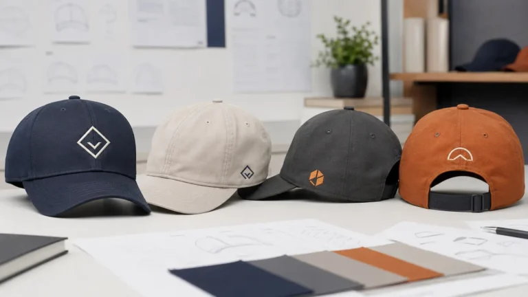
Creating an embroidery version is not the same as abandoning brand standards. Many brands maintain responsive logo variants for different sizes and media. A cap version can preserve the core mark while:
- removing a tagline;
- increasing spacing;
- thickening critical strokes;
- opening enclosed areas;
- replacing a script with a related block face;
- separating the icon from the company name;
- moving legal or descriptive text to a label, hangtag, packaging card, or digital page.
The buyer should approve both the revised digital artwork and the sewn outcome. The digital file shows the intended compromise; the sample shows what thread, fabric, and cap geometry actually produce.
Front, side, and back placement are not equivalent
Front embroidery
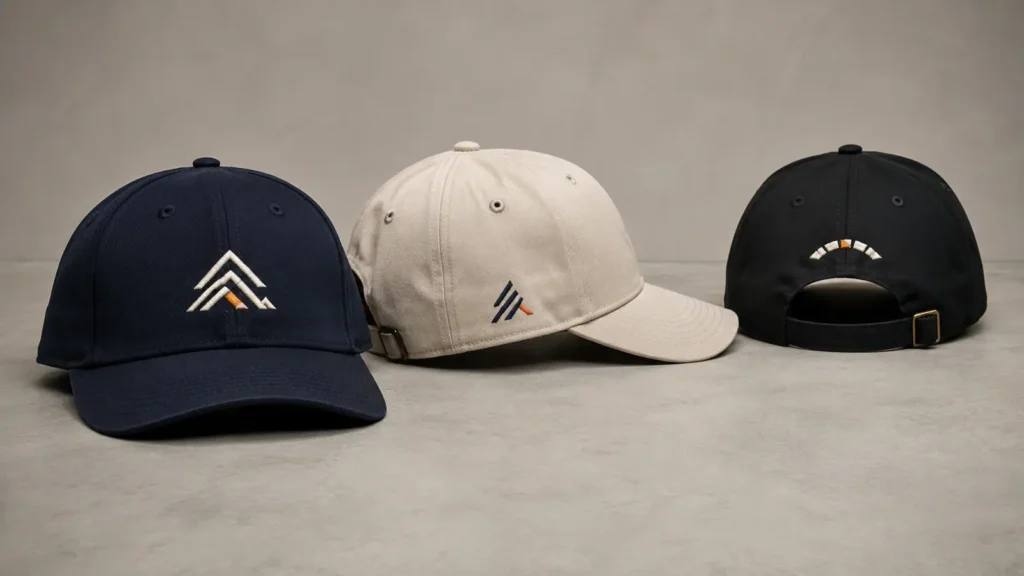
The front provides the largest visual field and usually the best chance to enlarge text. On a structured cap, the front panels may offer helpful support, but a six-panel cap introduces a center seam. Small letters crossing that seam can change height, angle, or density. Center-out digitizing and proper framing reduce risk, but the seam remains a physical feature.
A five-panel front can remove the vertical center seam from the primary decoration area, which may help certain wordmarks. However, panel shape, front structure, crown height, and the position of the visor still constrain the embroidery field. Do not assume that “five panel” automatically means unlimited detail.
Side embroidery
Side areas are smaller and more curved. They may also sit near eyelets, panel seams, or the lower edge of the crown. Short initials, a simple icon, or a brief secondary mark usually works better than a long slogan. If the side message is important, request the supplier’s maximum recommended field for the exact cap style and placement.
Back embroidery
Rear embroidery may be placed above an opening, along an arch, or on one rear panel. An adjustable strap, metal clasp, mesh panel, closure opening, and rear seams can reduce the usable field. Arched text also changes letter angle and spacing along a curve. A website address that looks adequate in a straight line may become crowded when arched over the closure.
Approve placement from fixed cap landmarks. “Centered” is not enough: specify the distance above the visor or closure, design dimensions, and whether the art crosses a seam.
Fine thread can help, but it changes the production system
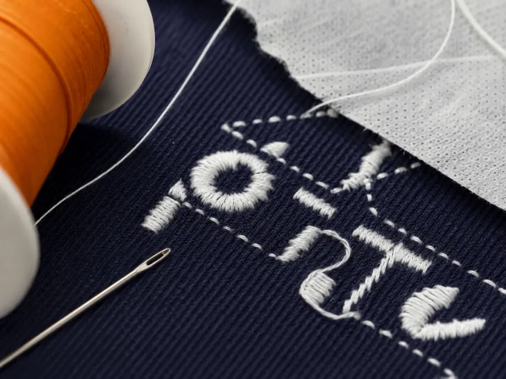
Finer thread occupies less visual space and can preserve smaller openings. Madeira recommends 60-weight thread for small lettering and fine detail and pairs it with a smaller needle and adjusted digitizing density. This can make a meaningful difference when the artwork truly needs detail.
However, a buyer should not simply write “use thinner thread” on a purchase order. Confirm:
- the exact thread type and color availability;
- the compatible needle and machine setup;
- whether the complete design or only selected areas use fine thread;
- the revised density and stitch structure;
- whether the cap fabric and backing remain stable;
- how the thinner line looks at normal viewing distance;
- whether repeat orders will use the same approved specification.
Fine thread may create a cleaner technical result while giving less visual weight than standard thread. That trade-off matters on team caps and promotional headwear intended to be recognized from several feet away. If the text is only legible under a loupe, the design may have met a machine challenge without meeting the buyer’s communication objective.
Flat embroidery versus 3D puff for small text
Flat embroidery is normally the first direct-embroidery method to test for small lettering. It does not have to cover a foam layer, and it can use running stitches or narrower satin constructions where appropriate. Even so, flat embroidery still needs sufficient stroke width, spacing, and fabric control.
3D puff is designed to create height. Foam sits under the stitches, and the satin columns must cover and hold that foam. The design also needs suitable end treatments so foam does not remain exposed. Madeira describes column-based art and satin stitches as the more effective basis for 3D foam. Wilcom’s 3D puff guidance similarly explains that the feasibility depends on satin-column width and open areas, not on text height alone.
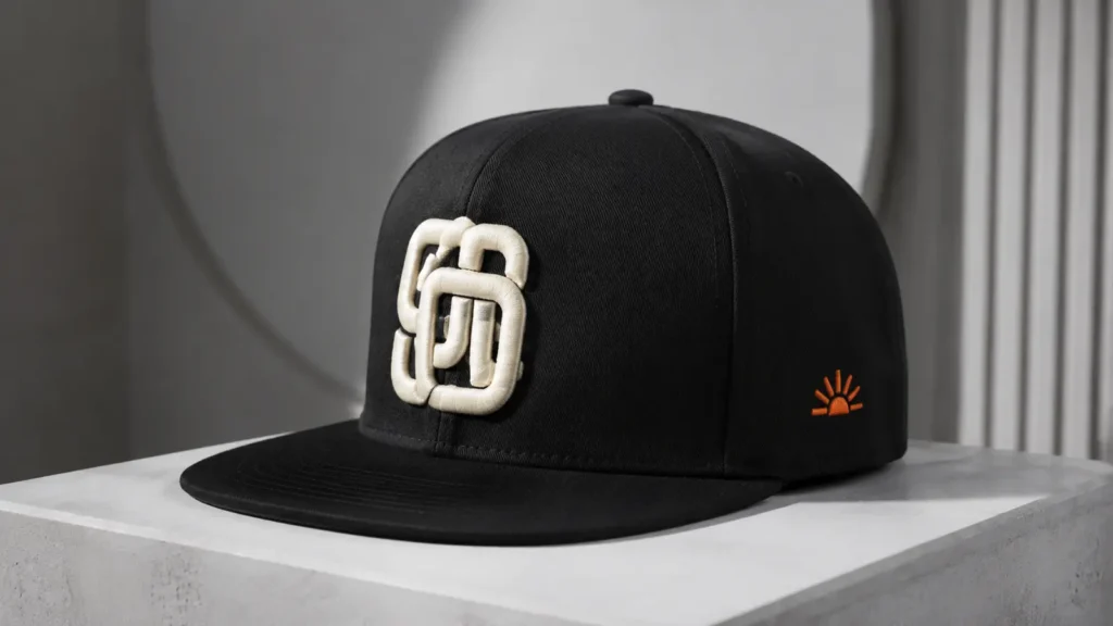
| Criterion | Flat embroidery | 3D puff embroidery |
|---|---|---|
| Small text | Better direct-embroidery candidate | Generally unsuitable when strokes, gaps, or counters are narrow |
| Visual character | Clean, lower profile | Bold, raised, athletic or streetwear appearance |
| Design geometry | More flexible | Requires broad satin columns and foam-compatible shapes |
| Fine punctuation | Difficult but sometimes testable | High risk |
| Typical role | Taglines, short text, side marks, details | Bold initials, numbers, monograms, broad front lettering |
| Approval priority | Readability and registration | Foam coverage, edge closure, height consistency, and shape |
A useful hybrid cap can use 3D puff for a bold main monogram and flat embroidery for a short secondary element. Do not apply puff to an entire complex logo simply because the buyer wants a dimensional effect. Read the related guide: Flat vs 3D Puff Embroidery for Hats.
Is a woven patch better for detailed text?
Often, yes. A woven patch uses finer yarns woven into a relatively flat surface, so it can represent thinner lines and smaller details more cleanly than conventional embroidered patches or direct embroidery. World Emblem’s method comparison specifically notes that woven patches can accommodate fine detail and small lettering that embroidery cannot.
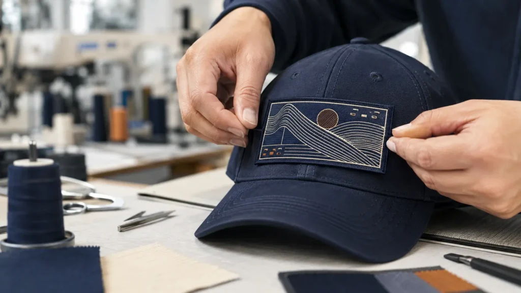
But “woven” is not a universal permission to keep every detail. Patch size, border, yarn, color contrast, attachment method, cap curvature, and the distance from which the message must be read still matter. A large detailed patch may also feel visually heavy on a low-profile or unstructured cap.
Choose a woven patch when:
- small lettering is essential to the identity;
- thin outlines or multiple internal details must remain distinct;
- a flat, refined finish suits the product;
- the patch shape fits the cap panel;
- the buyer accepts a patch edge as part of the design.
Choose direct flat embroidery when:
- the design can be simplified;
- tactile stitched texture is important;
- the text can be enlarged;
- a clean mark without a patch border is preferred.
For a broader method comparison, link this article to the site’s Embroidered vs Woven Patch guide after confirming its final URL.
Should a website address be embroidered on a hat?
A short domain can be embroidered, but a URL is often a poor use of a small cap area. Narrow characters and punctuation may remain technically separate yet unreadable at normal viewing distance.
Before embroidering a URL, ask:
- Is the address short enough to use a larger capital or x-height?
- Can “www.”, “https://,” a trailing slash, or a long path be removed?
- Is the domain already easy to remember from the brand name?
- Would the brand mark on the cap and the URL on a hangtag, inside label, packaging card, or event display work better?
- Does the punctuation remain visible in a real sewn sample?
A QR code is not automatically better: its square geometry can distort in cap embroidery. If scannability is required, use a suitable method and validate the final applied code with multiple phones.
How to redesign small text without losing the message
Option 1: Enlarge the text
Increase capital height, total width, or both. If the available area is fixed, shorten the wording and check the revised proportions on the intended crown.
Option 2: Simplify the font and spacing
Use a simple block style, remove fragile serifs, open counters, and increase tracking. Save the approved embroidery adaptation as a separate production asset.
Option 3: Separate the icon and text
Place the icon on the front and move descriptive copy to the side, back, label, or packaging.
Option 4: Remove low-value copy
Taglines, dates, legal suffixes, and service lists often become unreadable at cap scale. Remove copy that does not improve recognition.
Option 5: Use a woven patch
Use a woven patch when fine definition matters more than raised stitch texture, then test its flexibility and edge appearance on the real crown.
Option 6: Use another decoration method
Depending on the cap and target look, consider a printed, heat-transfer, rubber/PVC, leather-style, or label solution. Approve the chosen method through a finished sample.
Physical sample approval: the step that prevents bulk disputes
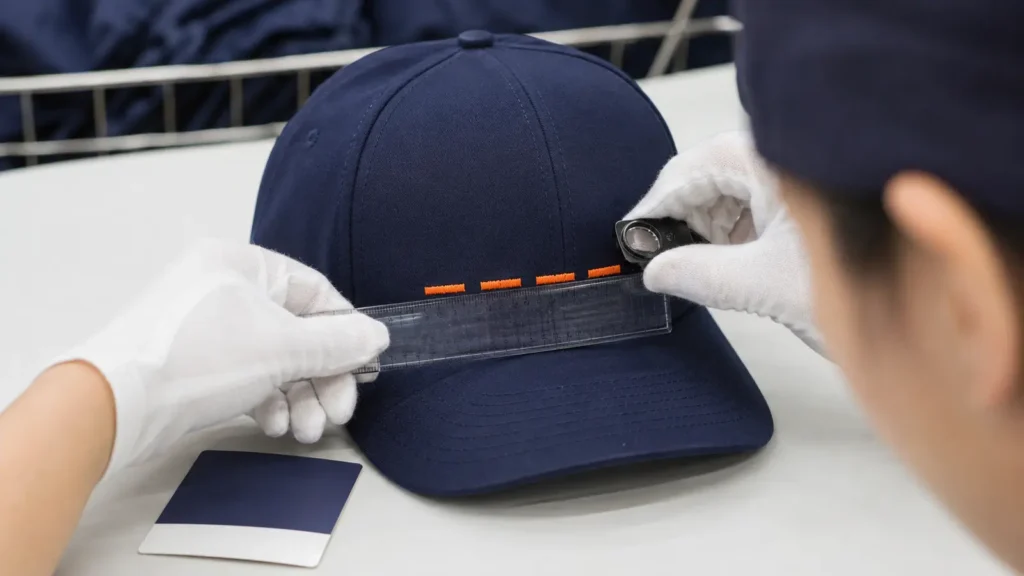
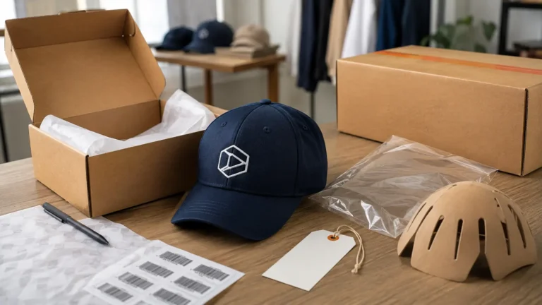
A digital mockup confirms position, scale, color intent, and general appearance. It does not show thread buildup, fabric movement, center-seam behavior, foam coverage, backing visibility, or real-world legibility. For small text, the physical sample is the decisive approval stage.
What to check on the sample
| Checkpoint | Approval question | Record in the approved specification |
|---|---|---|
| Letter height | Does the sewn height match the agreed measurement? | Capital height and overall design dimensions |
| Counters | Are openings in A, B, D, O, P, R, and lowercase letters still open? | Close photographs and acceptance notes |
| Spacing | Can neighboring characters be distinguished? | Approved digitized file version |
| Punctuation | Are dots, hyphens, and slashes visible and correctly placed? | Exact approved wording |
| Seam behavior | Does the center seam distort nearby strokes? | Placement relative to seam |
| Edge quality | Are satin edges clean without excessive looping or exposed foam? | Method, thread, foam if used, and visual standard |
| Fabric stability | Is there puckering, rippling, or crown distortion? | Cap model, backing, hooping setup, and placement |
| Normal-distance reading | Can the intended viewer read it without a loupe? | Agreed inspection distance and lighting |
| Color contrast | Does thread remain distinct from the cap? | Thread reference and cap color |
| Bulk repeatability | Can the setup be documented and reproduced? | Machine file, sequence, cap model, and signed sample |
Inspect the sample in three ways: close-up for stitch defects, at arm’s length for the wearer’s view, and from a normal social or retail viewing distance for communication value. Photograph the approved sample from the front and oblique angles. Keep one signed or sealed reference sample when the order value and repeat potential justify it.
For production inspection, compare bulk pieces with the approved sample rather than with the original vector art alone. Small deviations may appear larger in tiny lettering, so define which dimensions and visible defects require rework or rejection before production begins.
What to send a supplier for an accurate quotation
To evaluate small text rather than merely quote a generic embroidery charge, send:
- vector artwork in AI, EPS, SVG, or editable PDF where available;
- exact wording typed in the email or specification, not only outlined artwork;
- the font name or licensed font file when permitted;
- target capital height and total design width in millimeters;
- minimum acceptable text size if several versions may be tested;
- intended cap style and construction;
- cap color and thread colors;
- front, side, or rear placement with measurements;
- flat embroidery, 3D puff, woven patch, or “supplier to recommend”;
- order quantity by color and cap style;
- required labels, packaging, and target delivery date;
- viewing or functional requirement, such as “domain must be readable at arm’s length”;
- a request for an actual-size embroidered sample before bulk approval.
If the logo contains both a bold mark and tiny copy, ask for two options: a faithful attempt at the requested size and a production-recommended simplified version. Comparing physical samples makes the trade-off visible to everyone involved.
Planning a custom cap order? Send JIUMU the vector logo, exact text, target embroidery dimensions, cap style, placement, quantity, colors, packaging requirements, and delivery target. The team can review whether flat embroidery, 3D puff, or a patch should be sampled first. Request a custom quotation or explore custom baseball caps.
Questions to ask before approving the order
- What exact letter height and design width will be sewn?
- Is the size recommendation based on the selected cap or on flat fabric?
- Which thread weight, needle, backing, and embroidery method will be used?
- Will the design cross a center seam, eyelet, or closure-related area?
- Has the file been digitized specifically for caps and for this size?
- Which elements were simplified, thickened, widened, or removed?
- Is 3D puff limited to foam-compatible strokes and shapes?
- Can the supplier provide a close-up and normal-distance image of the sample?
- Will the bulk order use the approved digitized file and cap model?
- How will first-piece and in-line inspections compare counters, spacing, placement, and crown distortion?
Common mistakes in small-text cap orders
Approving only a digital mockup
Mockups show layout, not displaced fabric and physical thread. Approve the sewn result.
Using print artwork without an embroidery adaptation
Print can reproduce details embroidery cannot. Keep a master logo and an approved cap version.
Specifying font point size instead of sewn dimensions
Point size does not define the sewn capital height, stroke width, or total word width. Use physical dimensions.
Making the file denser to “improve quality”
More stitches can crowd counters, harden the decoration, and worsen registration. Density must suit the thread, material, and size.
Applying 3D puff to every element
Use puff selectively for broad shapes; keep fine information flat or move it to another method.
Changing the cap after sample approval
A different crown, fabric, seam, or embroidery field can change the result. A cap substitution should trigger sample review.
Judging only with magnification
Magnification finds defects; normal-distance viewing tests communication.
How JIUMU supports custom cap development
Established in 2010, JIUMU supplies custom hats and branded merchandise for B2B buyers in North America and Europe. Cap-development support includes OEM/ODM, mockups, physical samples, embroidery and patch options, Pantone matching, private labels, packaging, quality control, and export support.
JIUMU reviews artwork alongside cap style, placement, dimensions, quantity, colors, packaging, and delivery requirements. A physical sample then confirms the decoration method before bulk production. Typical MOQ is 50 pieces, subject to product structure and customization.
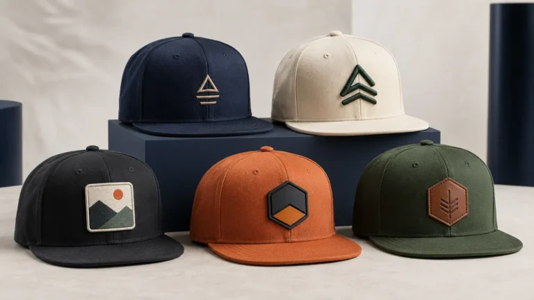
Buyers comparing silhouettes can review custom baseball caps and custom snapback hats. The decoration choice should follow the chosen cap and artwork, not precede them.
Frequently Asked Questions
Final recommendation
Small text looks bad in hat embroidery when the artwork asks thread to preserve openings, spacing, and stroke detail that are too small for the selected cap and process. The solution is not a single magic minimum. It is a controlled decision: simplify the typography, give the letters room, select flat embroidery or a woven patch when appropriate, reserve 3D puff for bold foam-compatible shapes, and approve the design on the actual cap at actual size.
Treat readability as an acceptance criterion. If a tagline or website must communicate, define the intended distance and check it outside a macro photograph. If the message cannot survive the cap’s physical limits, move it rather than forcing it into unreadable stitches.
Request a sample-led recommendation from JIUMU. Send your vector artwork, exact wording, cap style, embroidery placement, finished dimensions, quantity, colors, packaging requirements, and target delivery date to zhengdong@jiumugear.com or WhatsApp +86 18507502899. Start your custom cap inquiry.